Artwork in Animation, Part 1
As many of you know, I regularly post on Thad's excellent blog, "Animation ID". Thad has most graciously deemed me as one of his prime influences on identifying animators and their art styles. Granted, this is something I have a huge interest in anyway, but being recognized for it just makes it all the more worthwhile.
So really, how does a person decipher who drew and animated what?
Well, we all will have our own methods- but it's important to figure out how to train our 'eye' to do it.
Having been in the animation field for a brief while once I left Animation college, I can take the approach that knowing how animation is created and having done it myself has given me that edge to better pick out certain artists' styles. While in the field I noticed that everyone, and I mean EVERYONE, whether or not they attest to it, has got an individual 'look' about what they create. It's a big part of their artistic individualism. This kind of thing I compare to a signature, and use the same analogy because the similar factors are still there.
Most people sign their names, or handwrite a sentence. Once you become familiar with their penmanship, you could see something that was written and identify who wrote it. Many people have unique little flairs in their style, like making bubble dots for their "i"s or dropping letters down far below the margin of the rest of them. Most of you can see a handwritten birthday card or Christmas card envelope, and before looking at the inside can say, "Ah, a card from (whomever)".
Identifying animator's styles works the same way, except that there's more to just spotting the artwork to recognize the creator. However, it all starts with one thing- that artist's 'signature'. ...And when applying the recognition elements to the moving artwork, many more things have to be kept in mind: the movement, posing, staging, character construction, timing, etc.
For this first section of identifying animation, I'm going to focus on that 'signature' of the artist. What I mean here, is not that they physically signed their name to the work- but what they gave to the creation of the artwork that reveals their penning into it. I want to begin using static drawings, so as not to complicate the issue by adding in those other elements of animation just yet.
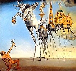
Let's look outside of animation for a moment for a broader exercise of our technique scrutinization. Most of us can recognize artwork created by famous artists: we instantly know a George Seurat when we see the dot pattern of his paintings; we recognize a Pablo Picasso by the ultra-stylized subject matter; and we point out a Salvatore Dali by the surrealistic impact of his designs. If we were to see three paintings in a row, one from each of these famous artists, without looking at the signature would we know the difference between them? Of course.


Although this may seem fantastically obvious, you've got the basic idea- now to move it up a bit- stripping away all the embellishments of the painted artwork. Next I will use another example- comic art, because it contains the same artistic elemets but the lavish decorations are not there.
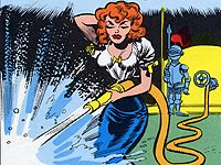
Here are three single panels from three different artists who all worked for the same publishing company in the 50s; all these contributions were usually present within the same single magazine at one time, just like contributing artists to a cartoon. Can you look at them, and tell the difference?

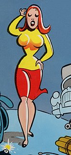
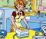
Sure, its easy. Why? They're all just drawings of a red-haired woman of some type. But each one is depicted with an individual flair that makes her different from the other two. The three artists, which are easily recognizable, are Jack Davis, Harvey Kurtzman, and Wallace Wood- all of whom have vastly different ‘signatures’- this is the way they express themselves in their artwork.
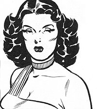
And now we’ll take away the colour and the background elements and make it a little bit harder. Look at the art style of these next three, especially focusing on the line quality (the thickness, the flowing movement of, the absence or abundance of, etc) of these three drawings of a similar woman- all are dark-haired but each one constructed in a wholly different manner.

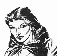
What makes them stand apart? What defines them from the other two? They're all drawn in pen-and-ink yet each one has characteristics that differentiate her from the others without using colours. What elements are displayed for each woman that gives her an individual appearance? Especially study the facial features and their individual ‘signatures’- ways they use their lines to depict form, how they show raised and lowered shapes, etc. These three examples come from Johnny Craig, Reed Crandall, and the most excellent George Evans.
Now let's look at the same comparison but all of the same character.
In order not to pick up on any biasing of familiar characters, I selected “Rudolph” from the WB cartoon, “Puss N Booty”. Here are four screenshot stills of the cat from the cartoon (I tried to get poses that weren’t too full of action). Look at them and notice what makes each cat different from the others.
It's getting a little more difficult, isn’t it? Well, let’s elaborate on the differentiating ‘signatures’ of each animator.
The first shot is a scene animated by Don Williams (this is possibly a rogue effort before he went to Universal Studios and worked on his first cartoon there, “Abou Ben Boogie”… he was previously at MGM in the early 40s, then reappeared in McKimson’s unit at WB a few years later). Anyway, Don’s characters in the mid-40’s are usually kind of chunky-looking and angular. He paid good attention to details but got selective when rendering them. His characters quite often had thicker eyebrows and would stand bowlegged and pigeon-toed. He overused the dry paint wipes whenever his characters shot from one pose to the other. Anyway, in this frame, notice some of these elements in action: the heavy eyebrows, the ‘square-ish’ chunky rendition of the character, and the attention to details on the face and paws but not on the cheek tufts.
The next screenshot is by animator Cal Dalton. What is obvious about Cal’s version of the cat? For one, you will notice the simplistic design- rounded little paws and feet without attention paid to toes or claws, lack of real detailing anywhere except in a few places for fur, and the head and face are almost primitive in appearance. Rudolph only has two whiskers- where Don and Art drew all three. In opposition to Art Davis for example, the cat’s eyes seem too small (Cal must have interpreted the cat as too evil) and the face just doesn’t have that same expressive quality as Davis or Williams- also notice the absence of the eye border colouring that Don and Art used for expressions. Cal also quite often hides forms under/behind/out of perspective to other forms so that he wouldn’t have to draw them.
The last screenshot is the brief handiwork of James Culhane (I know what you’re thinking, but remember, this cartoon was RELEASED in 1943- production on it probably had begun in early-to-late 1942, before Culhane transferred and directed his first Universal cartoon, “Pass The Biscuits Mirandy” in 1943. Courtesy of Tim Cohea, here is a Xerox of the cat design model by him, which show that he had some involvement in this cartoon....
Hopefully this helps give some of the basic things to watch for when studying an individual’s artwork. Being able to recognize ‘signatures’ from stills will help get it easier when viewing animated sequences by artist.
Next time- more about artist styles in still artwork.
So really, how does a person decipher who drew and animated what?
Well, we all will have our own methods- but it's important to figure out how to train our 'eye' to do it.
Having been in the animation field for a brief while once I left Animation college, I can take the approach that knowing how animation is created and having done it myself has given me that edge to better pick out certain artists' styles. While in the field I noticed that everyone, and I mean EVERYONE, whether or not they attest to it, has got an individual 'look' about what they create. It's a big part of their artistic individualism. This kind of thing I compare to a signature, and use the same analogy because the similar factors are still there.
Most people sign their names, or handwrite a sentence. Once you become familiar with their penmanship, you could see something that was written and identify who wrote it. Many people have unique little flairs in their style, like making bubble dots for their "i"s or dropping letters down far below the margin of the rest of them. Most of you can see a handwritten birthday card or Christmas card envelope, and before looking at the inside can say, "Ah, a card from (whomever)".
Identifying animator's styles works the same way, except that there's more to just spotting the artwork to recognize the creator. However, it all starts with one thing- that artist's 'signature'. ...And when applying the recognition elements to the moving artwork, many more things have to be kept in mind: the movement, posing, staging, character construction, timing, etc.
For this first section of identifying animation, I'm going to focus on that 'signature' of the artist. What I mean here, is not that they physically signed their name to the work- but what they gave to the creation of the artwork that reveals their penning into it. I want to begin using static drawings, so as not to complicate the issue by adding in those other elements of animation just yet.
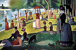
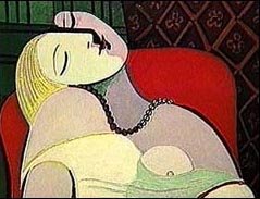
Let's look outside of animation for a moment for a broader exercise of our technique scrutinization. Most of us can recognize artwork created by famous artists: we instantly know a George Seurat when we see the dot pattern of his paintings; we recognize a Pablo Picasso by the ultra-stylized subject matter; and we point out a Salvatore Dali by the surrealistic impact of his designs. If we were to see three paintings in a row, one from each of these famous artists, without looking at the signature would we know the difference between them? Of course.

Although this may seem fantastically obvious, you've got the basic idea- now to move it up a bit- stripping away all the embellishments of the painted artwork. Next I will use another example- comic art, because it contains the same artistic elemets but the lavish decorations are not there.
Here are three single panels from three different artists who all worked for the same publishing company in the 50s; all these contributions were usually present within the same single magazine at one time, just like contributing artists to a cartoon. Can you look at them, and tell the difference?


Sure, its easy. Why? They're all just drawings of a red-haired woman of some type. But each one is depicted with an individual flair that makes her different from the other two. The three artists, which are easily recognizable, are Jack Davis, Harvey Kurtzman, and Wallace Wood- all of whom have vastly different ‘signatures’- this is the way they express themselves in their artwork.
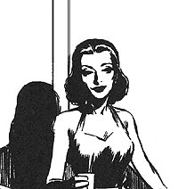
And now we’ll take away the colour and the background elements and make it a little bit harder. Look at the art style of these next three, especially focusing on the line quality (the thickness, the flowing movement of, the absence or abundance of, etc) of these three drawings of a similar woman- all are dark-haired but each one constructed in a wholly different manner.


What makes them stand apart? What defines them from the other two? They're all drawn in pen-and-ink yet each one has characteristics that differentiate her from the others without using colours. What elements are displayed for each woman that gives her an individual appearance? Especially study the facial features and their individual ‘signatures’- ways they use their lines to depict form, how they show raised and lowered shapes, etc. These three examples come from Johnny Craig, Reed Crandall, and the most excellent George Evans.
Now let's look at the same comparison but all of the same character.
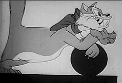
In order not to pick up on any biasing of familiar characters, I selected “Rudolph” from the WB cartoon, “Puss N Booty”. Here are four screenshot stills of the cat from the cartoon (I tried to get poses that weren’t too full of action). Look at them and notice what makes each cat different from the others.
It's getting a little more difficult, isn’t it? Well, let’s elaborate on the differentiating ‘signatures’ of each animator.

The first shot is a scene animated by Don Williams (this is possibly a rogue effort before he went to Universal Studios and worked on his first cartoon there, “Abou Ben Boogie”… he was previously at MGM in the early 40s, then reappeared in McKimson’s unit at WB a few years later). Anyway, Don’s characters in the mid-40’s are usually kind of chunky-looking and angular. He paid good attention to details but got selective when rendering them. His characters quite often had thicker eyebrows and would stand bowlegged and pigeon-toed. He overused the dry paint wipes whenever his characters shot from one pose to the other. Anyway, in this frame, notice some of these elements in action: the heavy eyebrows, the ‘square-ish’ chunky rendition of the character, and the attention to details on the face and paws but not on the cheek tufts.

The next screenshot is by animator Cal Dalton. What is obvious about Cal’s version of the cat? For one, you will notice the simplistic design- rounded little paws and feet without attention paid to toes or claws, lack of real detailing anywhere except in a few places for fur, and the head and face are almost primitive in appearance. Rudolph only has two whiskers- where Don and Art drew all three. In opposition to Art Davis for example, the cat’s eyes seem too small (Cal must have interpreted the cat as too evil) and the face just doesn’t have that same expressive quality as Davis or Williams- also notice the absence of the eye border colouring that Don and Art used for expressions. Cal also quite often hides forms under/behind/out of perspective to other forms so that he wouldn’t have to draw them.

The last screenshot is the brief handiwork of James Culhane (I know what you’re thinking, but remember, this cartoon was RELEASED in 1943- production on it probably had begun in early-to-late 1942, before Culhane transferred and directed his first Universal cartoon, “Pass The Biscuits Mirandy” in 1943. Courtesy of Tim Cohea, here is a Xerox of the cat design model by him, which show that he had some involvement in this cartoon....
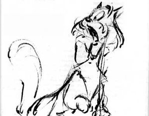
There is also speculation he animated in the WB cartoon, “Inki and the Minah Bird” also released in 1943- he stated this himself when I went to hear him speak in Toronto in the 1980s).
Anyway, the most discerning features are in the cat’s facial expression. There is quite a bit of detail in the focal parts- his face, the ribbon, the hands- all things that he learned to pay close attention to while at Disney. Again, the amount of space on the cat’s head devoted to his features is quite large- even with the big toothy grin. Culhane didn't draw any whiskers, yet the cat's face is still expressive. Notice how James is the only one who accentuated the cat's furry breast- you can see it in the screenshot above even though most of it is covered by Rudolph's arm. He was also a good person to change the shape of the cat's face to convey emotions, the same as Art Davis would. Also Culhane gave Rudolph a longer neck than the other animators- this is evident in the posed drawing above and the screenshot from the cartoon.
Hopefully this helps give some of the basic things to watch for when studying an individual’s artwork. Being able to recognize ‘signatures’ from stills will help get it easier when viewing animated sequences by artist.
Next time- more about artist styles in still artwork.
posted by Larry T at
4:02 PM
![]()


3 Comments:
Your detailed explanation of an animator's style, just looking not at a scene but at a single,solitay frame is something beyond me.
Simply amazing.
This is the stuff blogs are created for!
A marvellous way to share knowledge with people all around the world!
Dear Lawrence, I hope you'll delight us with more great posts like these.
Take care,
Your friend ( are we still? You never reply to my PMs, you big bad Zeke wolf...),
Andrea
By Duck Dodgers, at 5:45 PM
Hi Larry,
Good job here! You really are a great influence of mine, and a true friend. We need to get together some time! 16mm prints of certain shorts and Disney features make excellent movie nights... ;)
I did do a write-up on your piece, but took it down in favor of a sillier piece (Mark Mayerson probably saw it and plugged you on his fabulous blog). I'll put it back up tomorrow though!
Your pal,
- Thad
By Thad, at 8:39 PM
Great, great, great post!
This is obviously going to be on my list of top favorite stops. I'm a little chagrined that in all the years I've watched these cartoons, I've spent almost zero time figuring out who did what; even if I had the entire list of artists, I'd have no way of stopping and studying them and attributing this drawing or scene to that animator. But then, we didn't have any books or examples of drawings on the the subject to guide us back then--or even tapes! I think the only animators whose work I knew was Ken Harris' and Scribner, mainly die to Leonard Maltin's "Of Mice & Magic".
Anyway, very glad you're around and have figured so much of this out. Great work.
By Jenny Lerew, at 11:32 PM
Post a Comment
<< Home