Random semiconscious musings

Wednesday, June 28, 2006

WB Cartoon Credit Beauty

A couple of days ago I featured some of the weird results of WB's "Blue Ribbon" treatment on some fo the classic cartoons included in their re-release packages. Today I'm going to present a couple of neat aspects about the original cartoon titles.

Most of us are familiar with the boring old "Merrie Melody" theme tacked onto the cartoon opening with the generic "Blue Ribbon" title card which chops off any production information, contributor credits, and releae dates. In addition, even cartoons which should have been designated as "Looney Tunes" were stripped of their original series identification. In addition, the beautiful musical renditions of Carl Stalling were also genericized and removed from the titles.

Let's relive some of the neat and interesting opening title sequences! (PS: I don't have time to make DVDs or distribution tapes of any of these cartoons..... so please spare us both the trouble by not even asking for trades... thank you).

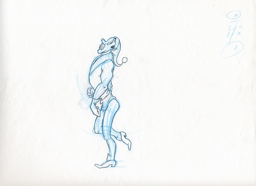
My first entry displays the original opening titles from the Merrie Melodie cartoon, "Mighty Hunters". Make note of how much nicer this opening is, compared to the yucky, boring old Blue Ribbon version:
"Mighty Hunters (1940)"


Next up- although this cartoon was not a victim of the "Blue Ribbon" treatment, an interesting title quirk was still dropped upon print syndication. The cartoon "Hop And Go" from 1943 was re-released under the Sunset/ Guild Films banner- although they weren't as bad as the "BR" releases, all the opening WB shields of the B&W Looney Tunes were taken off so that references to WB pictures were gone. In the case of this cartoon, it looked as if the cameraman used the same background layout for the opening zoom, making the effect that the WB shield is sitting on top of the target:

"Hop And Go (1943)"


Moving along, the beautiful opening sequences for two mid-1940s cartoons which were hacked off for the blase static title card. Pay particular attention to the wonderful music scores accompanying the full credit rosters, which were removed:


"Doggone Cats (1947)" (print courtesy of the holdings of Thad Komorowski)


"Hop, Look, And Listen (1948)"


Don't you agree that the original versions look much nicer?

After 1948 the Blue Ribbon treatment was adjusted a bit- at least the cartoons retained their animation and contributor credits- but the original cartoon designation as "Looney Tune" or "Merrie Melody" was still dropped, along with original production numbers, in favour of a generic opening title.
Here are some examples of original title sequences that were dropped with the "Blue Ribbon" openings:

"For Scent-mental Reasons (1949)"


"Daffy Duck Hunt (1949)"


"The Scarlet Pumpernickel (1950)"


"Cat-Tails For Two (1953)"


"Bell Hoppy (1954)"


And there you have it. WB cartoon credit beauty.

I do have an alterior motive for making this post- if any private film collectors who happen to pass by my humble little blog are aware of a rare and untampered print of theirs, make a small, unselfish gesture- contact WHV or the parties in question and see about offering your prints to be restored and archived so that the whole world can enjoy the cartoons as they were meant to be- because it's people like yourselves who care to preserve such uniquities that these elements may even exist. It won't lessen the value of your holdings at all, rather, it will increase the worth of the original even that much more (if you intended to sell, at any measure anyway).

Thank you- we now return you to your regular blog activity...

Tuesday, June 27, 2006

WB Cartoon Credit Weirdness

Most anyone who has watched animated cartoons on television while growing up can remember seeing the widely-distributed "AAP" cartoon package. If you'd have done your reading, you'd recall that when the Warner Brothers cartoons were redistributed to theatre owners in the late 40s, there were changes made so that the theatre owners who were paying for product to run with the feature-length films always had a cartoon to accompany the matinee experience.

Since the release output of the Warner cartoons did not quite size up to that of the motion pictures or newsreels, the Associated Artists Productions (in charge of 16mm distribution at the time) thought up a clever way to recirculate prints that had already had their once-around. They created what we know as the "Blue Ribbon" prints- cartoons re-released to the markets with their original titles removed and replaced with generic, bland, credit-less title cards. The thought behind it was clever: trick the theatres and movie audiences into thinking that every cartoon was a new one by re-issuing a new copyright date on each cartoon.

At the time, it didn't seem like a big problem. Nowadays, many people wish they could see those beautiful, uniquely-animated and scored titles as they once were, complete with production number and screen credits to those who worked on them.

However, the odd thing is that other 'side effects' happened to the Blue Ribbon prints: many had scenes removed; some were shortened significantly, others had 'questionable material' taken out. But the oddest thing includes some strange renditions of prints that made it out into the film buyer's market.

I have included some of these 'oddities' that have been talked about in animation forums and newsgroups, but not too many have witnessed.

Our first exhibit: what was referred to as the "Silent AAP". The cartoon "Super Rabbit", when redistributed, had the ownership AAP tacked on, but without any audio track... see for yourself. (For nostalgic purposes, I left on part of the network opening tags from WUAB Cleveland's "Bugs Bunny And Friends" show from which this cartoon was recorded).


Strange.
Our next exhibit features another weird oddity in the case of Blue Ribbon titles: the famed "Tweetie Pie" segment.
Many have deemed the original opening titles to the classic Academy-Award winner, "Tweetie Pie" to be lost forever, since no surviving prints can be located (personally, I think prints do exist somewhere, probably in private collections, since this was an Academy Award winner- but whether or not those individuals who hold those prints are aware of the situation, or care to share their print is another story). Anyway, when the Blue Ribbon title card was tacked on, some prints retained their original opening titles score, right into the cartoon, creating an odd-looking off-synched effect:


How someone actually passed that by a board a review is beyond me.... well, maybe that was the problem....

Our last exhibit features the unusual closing titles to the cartoon, "The Upstanding Sitter" featuring Daffy Duck. Now this one really goes beyond my understanding of quality control... although the cartoon maintains its original opening credits, it's the ending that gets messed up....

Check it out- both the incorrect visuals and some random audio title, pulled from a pre-1940s Merrie Melodie. Unfortunately, this ending isn't complete, because I suffered from the "VCR-that-backs-up-and-erases-the-last-bit-of-the-preceding-show" syndrome. But you get the idea:


I'd personally like to know what the person was smoking when they watched that rendition and believed it looked passable.

Next time- "WB Cartoon Credit Beauty".

Friday, June 16, 2006

More About 'Signatures'

In my previous posts, I elaborated on how each individual artist, whether they're conscious of it or not, has an inherent 'signature'. It loosely defines as a personal 'fingerprint' that says to all viewers, "_________ did this particular piece of art."

On this entry, I thought I might use some of my own artwork to point out more info about these 'signatures'.

A brief background on the sequence coming up: Sometime in the mid-80s I was working on a short film for entry into a Canadian Independent Film Festival (kind of like the 'Tournees' we're all aware of... the film never got finished by the way, but that's another story). Anyway, one scene had a very simple walk cycle of the character I designed. I said, very simple. As part of a mentoring program held at the College where I studied animation, first-year students were assigned to teams to assist with the production of these independent films. Now I'll admit, I've come a long way since then, and my artwork is ten times better than what you're about to see.

Two students were brought over to my 'unit', they were considered able to handle this section of work. I already knew I have a distinctive art style, especially in animation, and wanted the finished artwork to exhibit this 'look'. Suddenly I knew what Bill Tytla must have felt like, overseeing the work experience of these students and secretly wanting to redo all the work myself because I felt as if it just wasn't adhering up to my standards (I'm not considering myself near as talented as Mr. Tytla, but I wanted to use the example in my illustration above).

I needed roughly 8 drawings done for this one particular scene... just 8. I had 4 keys, each requiring 2 in-betweens to smooth out the action. The action was even-paced; no 'slow-outs' nor 'slow-ins'. Not complicated at all, I thought- all that was required was to imitate my penmanship closely enough. This is exactly the same mentality as many studios implement to maintain consistency (think MGM studios and Disney)- when this has been accomplished, we can move up to more detailed and tougher scenes.

Anyway, I went over things to think about when drawing this character. I presented them with ROUGH model sheets, a couple of which I have included below (Note: These images are watermarked, so don't even think about it... just in case you were thinking about it).


(Hey, I said I'd come a long way since then, didn't I?)

Anyway, this is the character I was working with. I presented them with the four keys, as shown below:

The character was being followed, so it was a brisk stride. You can see my timing charts in the top corner, inbetweens on /3's (clicking on these images will make them larger).

Now, here's where the 'signature' training I emphasized in the past two posts comes into play. I'm going to re-post my initial walk cycle key, and the next drawing in sequence, as rendered by one of the students. Compare them closely, what do you notice about the two drawings?

Aside from the blue pencil construction, study these two images. First off, can you tell they were done by two different people? What verifies that? Check out the line quality... one artist seems to work the line more to attain a smoother form on the character, the other seems to have traced the lines- they look like simple outlines. Notice how details are handled- the fabric fold on the character's back on the right-hand side has been omitted. The hand on the left-side drawing is beginning to pass over the butt- so it's as if the animator thought that since you can't see it, why think about what it might look like behind the hand? (Think Cal Dalton). As a result, the glutes have been drawn too flatly because focus was put on the hand in front. Actually, there's less attention to angles in the right-hand side overall.

Now, here's images comparing the work of the other assistant. I'll select a different key to keep you working with the comparisons.

This second artist is a bit better at working the line. Attention has been given to angles and rounded forms, which is good. However, there's a problem with proportioning: I already was aware of the odd, but intentional proportioning of the character in my design on the left. But it seems on the right that the guy has suddenly gained twenty pounds, or his limbs were shortened and got thicker. As soon as these images would have been coloured in, if I were to have used them in the final sequence the differences would have been made plain as day.

I want to point out that this is not a matter of calling one artist bad or good- each assistant handled certain aspects of the animation in a talented manner- except none could capture that 'signature' I have in my art style.

Obvious examples of this kind of thing are seen every day, especially in newspaper comic strips- you see aspects of an original artist's style, say Jim Davis or Bill Watterson, ripped off constantly and applied to other people's strips. John Kricfalusi and Stan Lee are particularly plagarized these days because of the popularity of their unique designs... flattering at best. But what happens is that someone takes notice of the artwork in question and says, "Hey, that looks like ______'s work"... but even though many of the techniques of the plagarized artist are depicted nicely, there's always some "Achille's heel" that becomes evident which announces that the work is not of the real McCoy.

However, in animation it's important to adhere to strict design guidelines. Warner Brothers was much more lax on this aspect- which makes their cartoons so fun to study. It's not necessarily a bad thing- it makes the final product more interesting. :) But that's how we recognize that animation 'signature'.

Friday, June 09, 2006

Artwork in Animation, Part 2

In my previous post, I discussed how important it is to view a specific artist's style in order to help one decide who did what. I emphasized how even down to the individual drawings, it's possible to seek out discerning factors which reveal the penning of artwork. Now we'll look at the actual animation.

Regarding the animation itself makes it easier to determine the artist. This is mostly due to the fact that now we have many other attributes outside of character construction and line quality which tell us more about who drew the section in question. We can look at the timing, the posing, the staging, plus even more 'signature' items which make their way into each scene.

Remembering the previous post, I pointed out four of the main artists who worked on the WB cartoon, "Puss N Booty" and what characteristics they added to their animation which made it possible to pinpoint the scenes they were assigned. Now we will have a chance to actually scrutinize the moving images by watching the cartoon.

In the same excellent manner that Thad K uses to identify artists in his blog, I have employed the same technique, as I feel that it's easier to make those idenitifications when there's current cues visible to study the accompanying action. Here is a brief summary to keep in mind when watching:


Art Davis:

  • wonderfully twists and distorts the characters around
  • uses the character's faces, expecially the eye movement, to convey expressionism- he also rounds the eye markings on Rudolph to contour the shape of the eye
  • sometimes goes off-model to achieve the impact of the action

Cal Dalton:

  • usually simplifies the character design too much, quite often dropping details
  • animation is sometimes rather primitive-looking and unusual in appearance
  • hides portions of animation behind other objects

Don Williams:

  • gives all characters a somewhat blocky-looking design (he builds characters out of geometric shapes and animates them that way)
  • uses dry paint wipes to move characters between poses (this is not so obvious in this particular cartoon, however)
  • characters have unsually heavy eyebrows
  • animation appears somewhat jerky- Don makes his key poses very significant

James Culhane:

  • gives specifics to the cat's design outside of the other artists, for example, the ruffled breast and minimal whiskers
  • accentuates the cat's expression by devoting more room to the face on the head
  • has a nice fluid motion to the action
Keeping all this in the back of your mind, and the specific scenes I mentioned previously, here's the cartoon to watch.... Enjoy!


Special thanks to Thad K for hosting and posting this cartoon on YouTube :D

Monday, June 05, 2006

Artwork in Animation, Part 1

As many of you know, I regularly post on Thad's excellent blog, "Animation ID". Thad has most graciously deemed me as one of his prime influences on identifying animators and their art styles. Granted, this is something I have a huge interest in anyway, but being recognized for it just makes it all the more worthwhile.

So really, how does a person decipher who drew and animated what?

Well, we all will have our own methods- but it's important to figure out how to train our 'eye' to do it.

Having been in the animation field for a brief while once I left Animation college, I can take the approach that knowing how animation is created and having done it myself has given me that edge to better pick out certain artists' styles. While in the field I noticed that everyone, and I mean EVERYONE, whether or not they attest to it, has got an individual 'look' about what they create. It's a big part of their artistic individualism. This kind of thing I compare to a signature, and use the same analogy because the similar factors are still there.

Most people sign their names, or handwrite a sentence. Once you become familiar with their penmanship, you could see something that was written and identify who wrote it. Many people have unique little flairs in their style, like making bubble dots for their "i"s or dropping letters down far below the margin of the rest of them. Most of you can see a handwritten birthday card or Christmas card envelope, and before looking at the inside can say, "Ah, a card from (whomever)".

Identifying animator's styles works the same way, except that there's more to just spotting the artwork to recognize the creator. However, it all starts with one thing- that artist's 'signature'. ...And when applying the recognition elements to the moving artwork, many more things have to be kept in mind: the movement, posing, staging, character construction, timing, etc.

For this first section of identifying animation, I'm going to focus on that 'signature' of the artist. What I mean here, is not that they physically signed their name to the work- but what they gave to the creation of the artwork that reveals their penning into it. I want to begin using static drawings, so as not to complicate the issue by adding in those other elements of animation just yet.

Let's look outside of animation for a moment for a broader exercise of our technique scrutinization. Most of us can recognize artwork created by famous artists: we instantly know a George Seurat when we see the dot pattern of his paintings; we recognize a Pablo Picasso by the ultra-stylized subject matter; and we point out a Salvatore Dali by the surrealistic impact of his designs. If we were to see three paintings in a row, one from each of these famous artists, without looking at the signature would we know the difference between them? Of course.


Although this may seem fantastically obvious, you've got the basic idea- now to move it up a bit- stripping away all the embellishments of the painted artwork. Next I will use another example- comic art, because it contains the same artistic elemets but the lavish decorations are not there.


Here are three single panels from three different artists who all worked for the same publishing company in the 50s; all these contributions were usually present within the same single magazine at one time, just like contributing artists to a cartoon. Can you look at them, and tell the difference?


Sure, its easy. Why? They're all just drawings of a red-haired woman of some type. But each one is depicted with an individual flair that makes her different from the other two. The three artists, which are easily recognizable, are Jack Davis, Harvey Kurtzman, and Wallace Wood- all of whom have vastly different ‘signatures’- this is the way they express themselves in their artwork.

And now we’ll take away the colour and the background elements and make it a little bit harder. Look at the art style of these next three, especially focusing on the line quality (the thickness, the flowing movement of, the absence or abundance of, etc) of these three drawings of a similar woman- all are dark-haired but each one constructed in a wholly different manner.


What makes them stand apart? What defines them from the other two? They're all drawn in pen-and-ink yet each one has characteristics that differentiate her from the others without using colours. What elements are displayed for each woman that gives her an individual appearance? Especially study the facial features and their individual ‘signatures’- ways they use their lines to depict form, how they show raised and lowered shapes, etc. These three examples come from Johnny Craig, Reed Crandall, and the most excellent George Evans.


Now let's look at the same comparison but all of the same character.
In order not to pick up on any biasing of familiar characters, I selected “Rudolph” from the WB cartoon, “Puss N Booty”. Here are four screenshot stills of the cat from the cartoon (I tried to get poses that weren’t too full of action). Look at them and notice what makes each cat different from the others.

It's getting a little more difficult, isn’t it? Well, let’s elaborate on the differentiating ‘signatures’ of each animator.


The first shot is a scene animated by Don Williams (this is possibly a rogue effort before he went to Universal Studios and worked on his first cartoon there, “Abou Ben Boogie”… he was previously at MGM in the early 40s, then reappeared in McKimson’s unit at WB a few years later). Anyway, Don’s characters in the mid-40’s are usually kind of chunky-looking and angular. He paid good attention to details but got selective when rendering them. His characters quite often had thicker eyebrows and would stand bowlegged and pigeon-toed. He overused the dry paint wipes whenever his characters shot from one pose to the other. Anyway, in this frame, notice some of these elements in action: the heavy eyebrows, the ‘square-ish’ chunky rendition of the character, and the attention to details on the face and paws but not on the cheek tufts.


This next grab is by Art Davis. Art had a wonderful method of twisting his characters around abnormally when they posed. Their facial expressions are always extremely well-done and especially noteworthy are the eyes: he could make any character “cartoony” looking- also notice how Rudolph's eye borders are rounded with the eyes, as opposed to Don Williams' squarish setting that the eyes sit inside. Note how Rudolph is a little off-model in order to accentuate his feelings of question- his shoulders are unusually narrow and his back has a kink in it that would not be possible, even for a cat. Also note how Rudolph’s facial features, particularly the cheeks, take up a lot more of his face.


The next screenshot is by animator Cal Dalton. What is obvious about Cal’s version of the cat? For one, you will notice the simplistic design- rounded little paws and feet without attention paid to toes or claws, lack of real detailing anywhere except in a few places for fur, and the head and face are almost primitive in appearance. Rudolph only has two whiskers- where Don and Art drew all three. In opposition to Art Davis for example, the cat’s eyes seem too small (Cal must have interpreted the cat as too evil) and the face just doesn’t have that same expressive quality as Davis or Williams- also notice the absence of the eye border colouring that Don and Art used for expressions. Cal also quite often hides forms under/behind/out of perspective to other forms so that he wouldn’t have to draw them.


The last screenshot is the brief handiwork of James Culhane (I know what you’re thinking, but remember, this cartoon was RELEASED in 1943- production on it probably had begun in early-to-late 1942, before Culhane transferred and directed his first Universal cartoon, “Pass The Biscuits Mirandy” in 1943. Courtesy of Tim Cohea, here is a Xerox of the cat design model by him, which show that he had some involvement in this cartoon....

There is also speculation he animated in the WB cartoon, “Inki and the Minah Bird” also released in 1943- he stated this himself when I went to hear him speak in Toronto in the 1980s).
Anyway, the most discerning features are in the cat’s facial expression. There is quite a bit of detail in the focal parts- his face, the ribbon, the hands- all things that he learned to pay close attention to while at Disney. Again, the amount of space on the cat’s head devoted to his features is quite large- even with the big toothy grin. Culhane didn't draw any whiskers, yet the cat's face is still expressive. Notice how James is the only one who accentuated the cat's furry breast- you can see it in the screenshot above even though most of it is covered by Rudolph's arm. He was also a good person to change the shape of the cat's face to convey emotions, the same as Art Davis would. Also Culhane gave Rudolph a longer neck than the other animators- this is evident in the posed drawing above and the screenshot from the cartoon.

Hopefully this helps give some of the basic things to watch for when studying an individual’s artwork. Being able to recognize ‘signatures’ from stills will help get it easier when viewing animated sequences by artist.

Next time- more about artist styles in still artwork.